Studio Archifiction led the renovation of the a2i office at ICT Tower to strengthen day to day workflow and establish a consistent identity inside the space. The goal stayed simple. The office should feel clear, calm, and unmistakably a2i.
For scope clarity and how we deliver office projects end to end, start here. Office interior design services.
This project sits inside our office interior work in Dhaka. It also sits inside our branding and renovation work. Both mattered because this was not only a layout upgrade. It was an identity reset with execution control.
What made this project hard
The design phase took longer because budget decisions shifted multiple times. The procurement entity and the PD team also changed over time. Different stakeholders carried different views on identity and messaging. Color, typography, and placement went through repeated review.
Change stayed controlled through a simple system. Each revision moved through a decision log. Options came with visible cost differences and a clear impact note. One zone got locked at a time. After approval, that zone stayed frozen until execution closed.
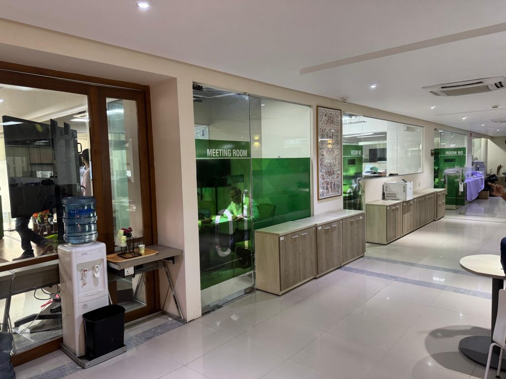
Agargaon adds operational pressure. Visitor movement stays high. Dust management matters every day. On the 13th floor, humidity stress shows up first at edges and joints. We selected finishes and detailing to resist scuffing and tolerate cleaning.
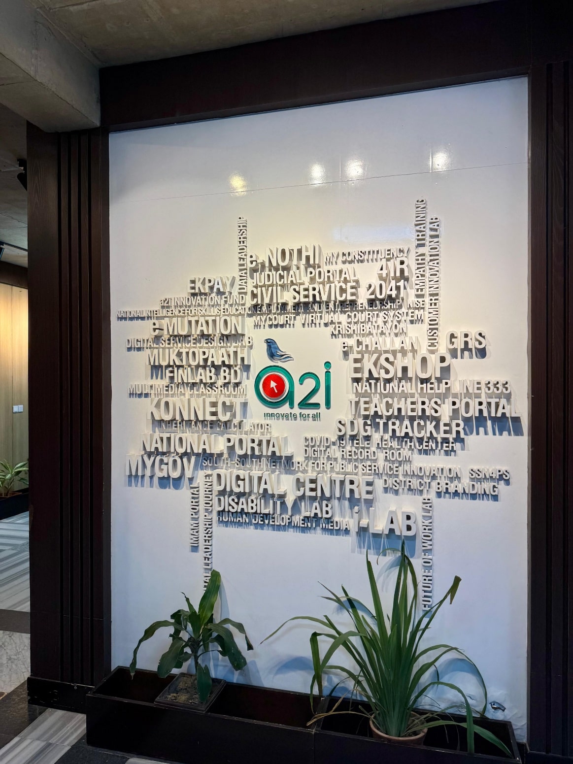
Brand statement that became repeatable
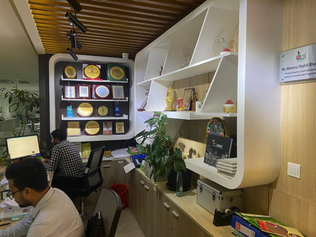
The target was a brand system, not one off decoration. Design elements and color established a clear a2i statement that teams can repeat for consistency across locations. This repeatability matters more than a single feature wall. It protects identity when new spaces get added later.
You can see the same government office discipline and workflow planning here. A2i office interior design at Daak Bhaban, Dhaka.
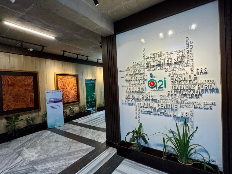
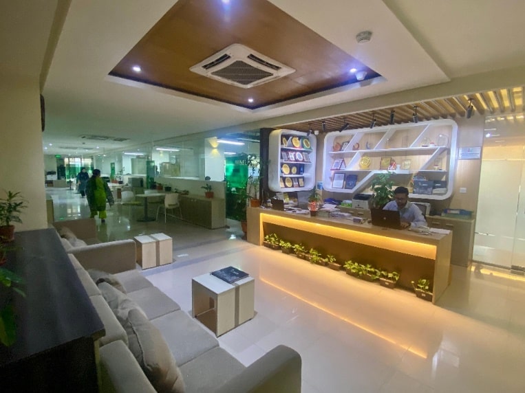
Feature wall and message control
Typography became the anchor of the visual system. It carries the message without noise. Scale, spacing, contrast, and sightlines were tested from entry and circulation points so the wall reads clean in real movement, not only in renders.
Identity stayed inside the build scope. It did not get treated as something added at the end. That decision reduced mismatch between approved design intent and on site output.
Brand walls pull services. Screens, power, data, access panels, and lighting often converge at the same plane. Early MEP coordination kept the wall clean and reduced future patchwork.
Lighting, airflow, and circulation
Movement paths were simplified to feel direct and predictable. This supports speed and reduces confusion for staff and visitors. Lighting comfort got equal attention. The aim was stable light, controlled glare, and balanced brightness across work zones and circulation.
A similar workflow first approach appears in our FinTech projects too. Ek-Pay office interior design case study.
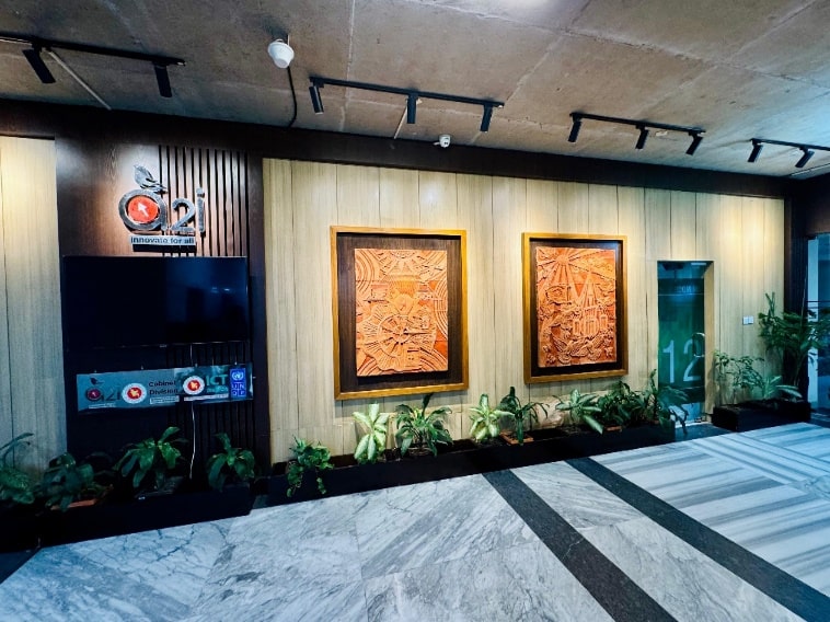
Materials, furniture, and daily durability
Finish choices focused on durability and maintenance. Furniture selection focused on ergonomic comfort and daily performance. The palette stayed controlled so the office supports identity without becoming difficult to maintain.
We prioritized anti scuff HPL laminate on high touch zones and reinforced sealed edge detailing where moisture risk stays higher. This kept surfaces stable under cleaning and daily traffic.
Supervision that protected the final result
Site control stayed tight through sample approvals and checkpoints. Key samples got approved before final fixing, including paint, laminate, and branding wall finish. Mockups helped confirm alignment, junction detailing, and readability under real lighting.
Issues were logged early and closed fast. The goal stayed consistent. The approved office should match what gets delivered on site.
We kept egress paths clear and maintained access to fire systems while planning partitions and branding walls. This aligns with BNBC 2020 Part 4 intent for fire protection access.
For a large corporate benchmark on finish control and coordination, review Corporate office interior in Mirpur, Dhaka.
If you are shortlisting an office interior design firm in Dhaka, compare partners by drawings, supervision checkpoints, and budget transparency. Office interior design firms in Dhaka.
Quote
“Brand identity only works when it stays consistent on site. We kept control on color, typography, and detailing so a2i can repeat the same brand language across offices without drift.”
Kazi Mohammad Alam Kaiser, Architect, Studio Archifiction
Result
This renovation delivered a more legible and consistent workplace in Dhaka. Identity reads clearly from entry. Circulation stays efficient. Lighting supports comfort and focus. The feature wall creates a strong first impression without overpowering the office.
Revised: February 2026